CATEGORY
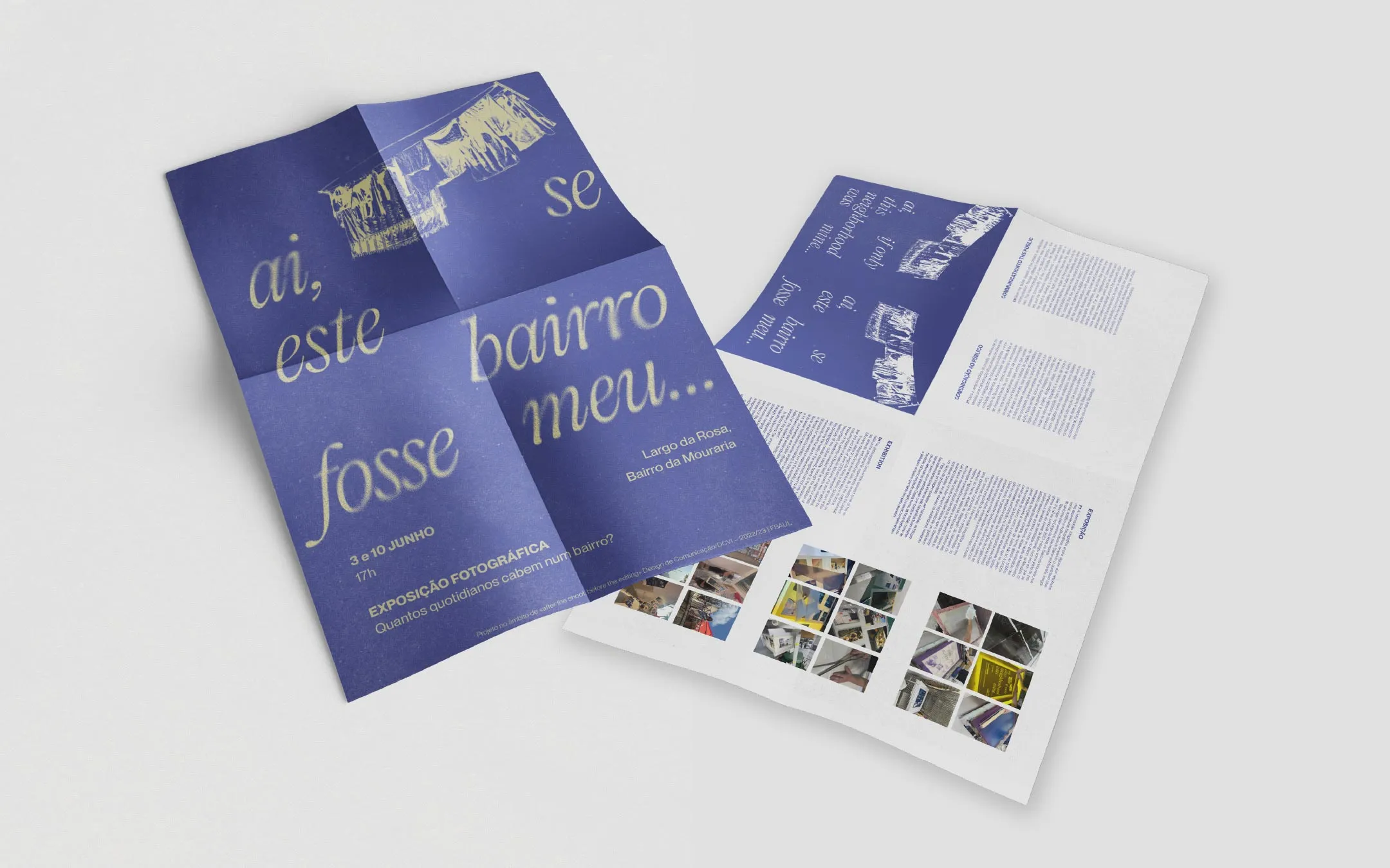
Poster Design
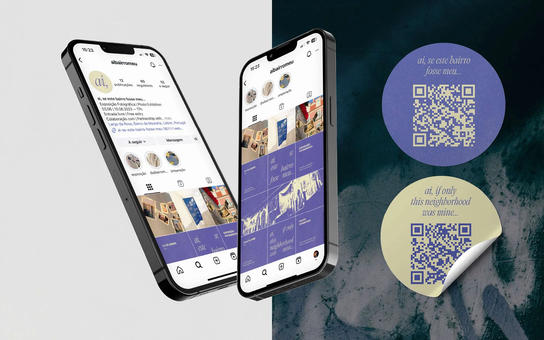
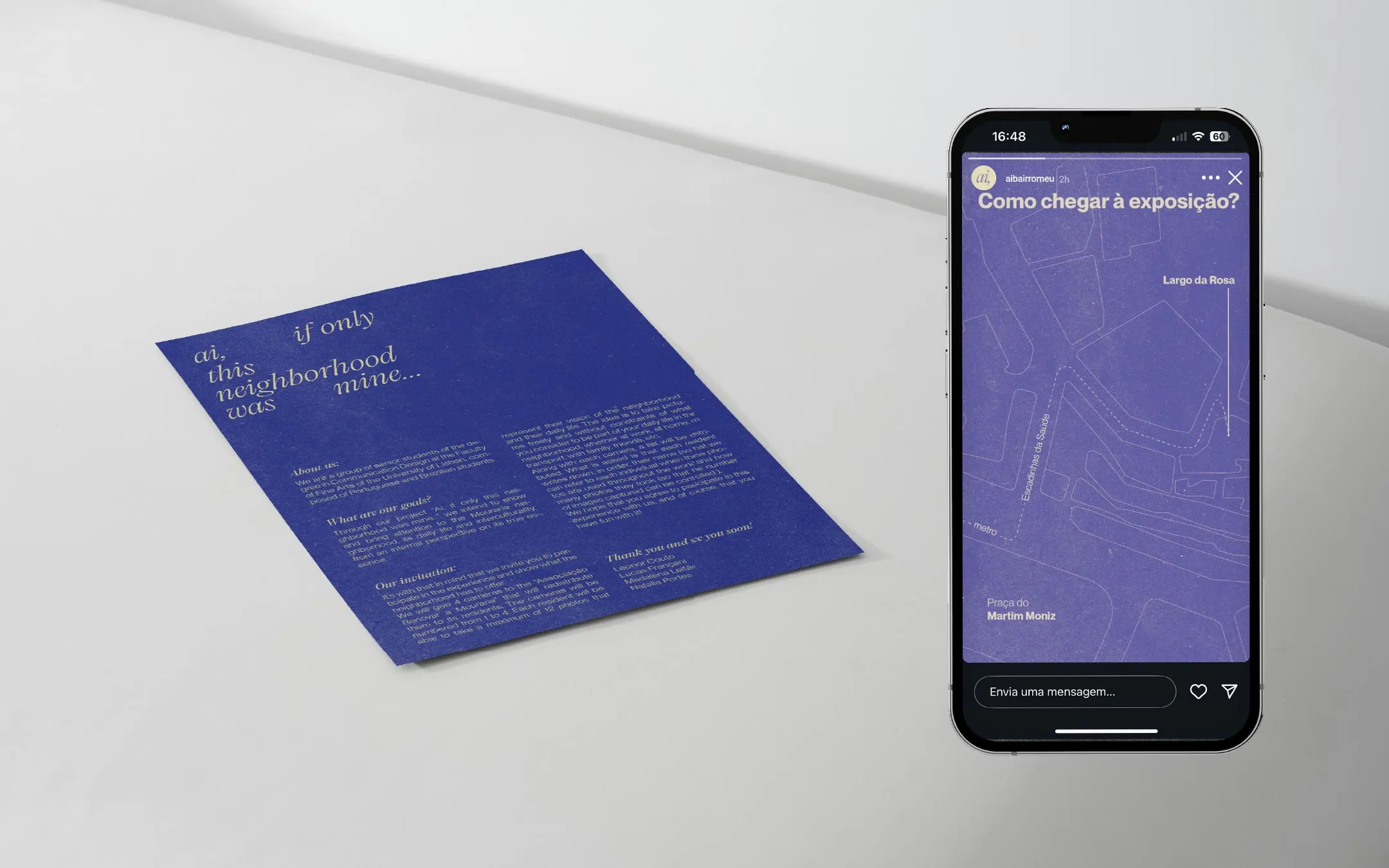
Social Media Design
Webdesign
Editorial Design
YEAR
2023
Project by [Conception, Assembly, Exhibition and Design]:
Leonor Couto (@leonorcouto_design)
Lucas Pranzano (@lucapranzano)
Madalena Leitão (@madalena.zip)
Natalia Portes (@_nataliaportes)
Course
Design de Comunicação VI, Faculdade de Belas-Artes da Universidade de Lisboa
Visual testimonies by:
Ada Conversi
Guilherme Pacheco
Hina Asim
Luana Gomes
Shawmi
Dona Sira
Under the motto “Globalization (the universal) as a cultural convergence of everyday lives (the pluriverse)”, "ai, se este bairro fosse meu..." is a social project that reflected the multicultural identity of Lisbon’s Mouraria neighbourhood. A proposal for reflection on the role of citizens in shaping the identity of shared spaces, exploring the possibilities of appropriation and redefinition of the territory. After all, how many everyday lives fit into a neighbourhood?
The name of the project reflects this contemplation, drawing inspiration from two sources. It adapts “Ai, Mouraria” by Amália Rodrigues, directly referencing the Mouraria neighborhood and its identity through the interjection “Ai”. It also evokes “Se essa rua fosse minha”, a popular Brazilian song symbolizing the desire to make the world of those we love more beautiful and special, transforming an ordinary space, like a street, into something extraordinary.
Ai Mouraria
Dos rouxinóis nos beirais
Dos vestidos cor-de-rosa
Dos pregões tradicionais
Ai, Mouraria - Amália Rodrigues
Se essa rua
Se essa rua fosse minha
Eu mandava ladrilhar
Com pedrinhas de brilhante
Para o meu amor passar
Cantiga Popular Brasileira
Exhibition
A project that, on June 3rd and 10th of 2023, stepped beyond the walls of FBAUL and walked into the real world through a photographic intervention. Installed at Largo da Rosa, it became part of the traditional festivities organized by (@renovaramouraria), offering glimpses of the neighborhood’s daily life.
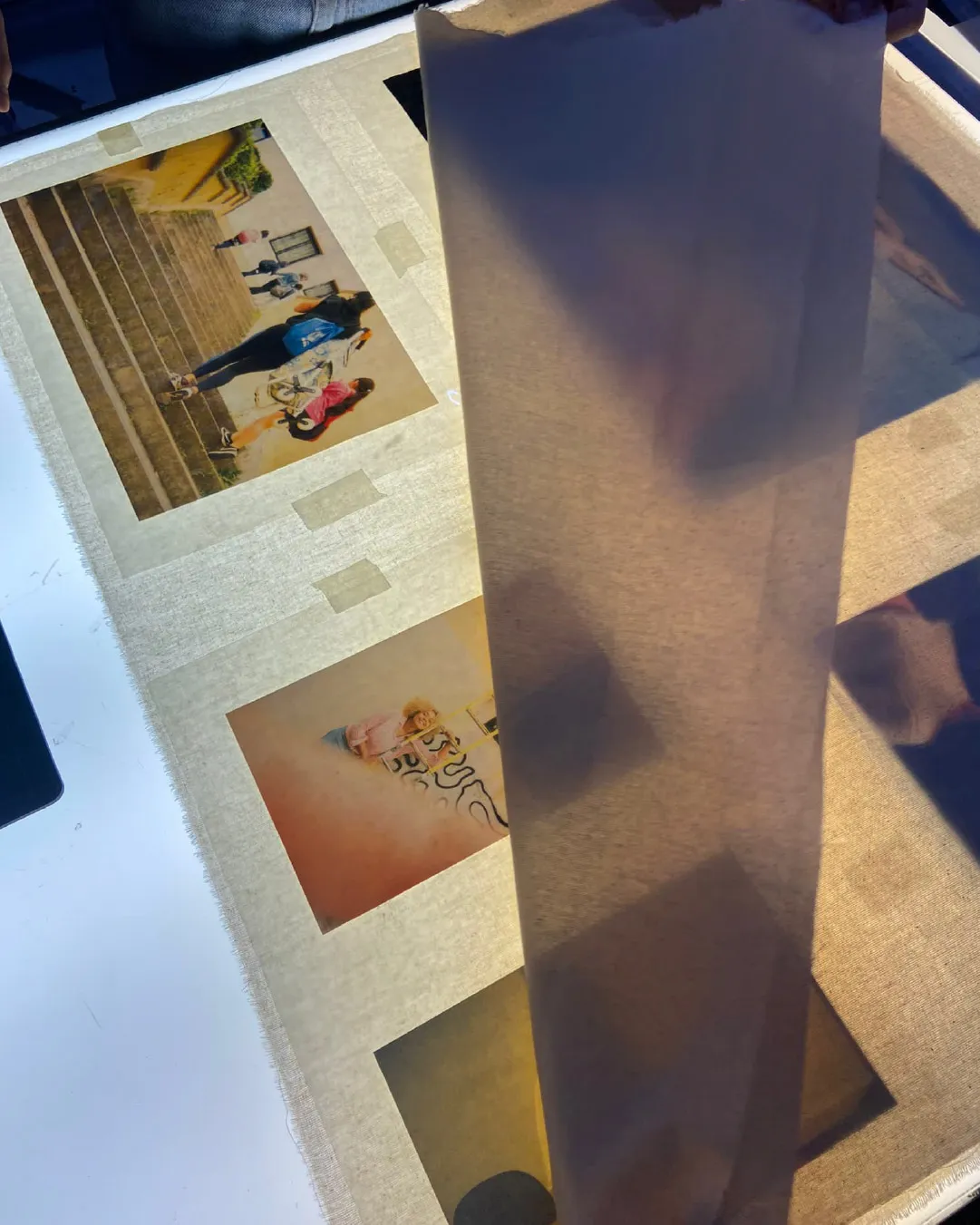
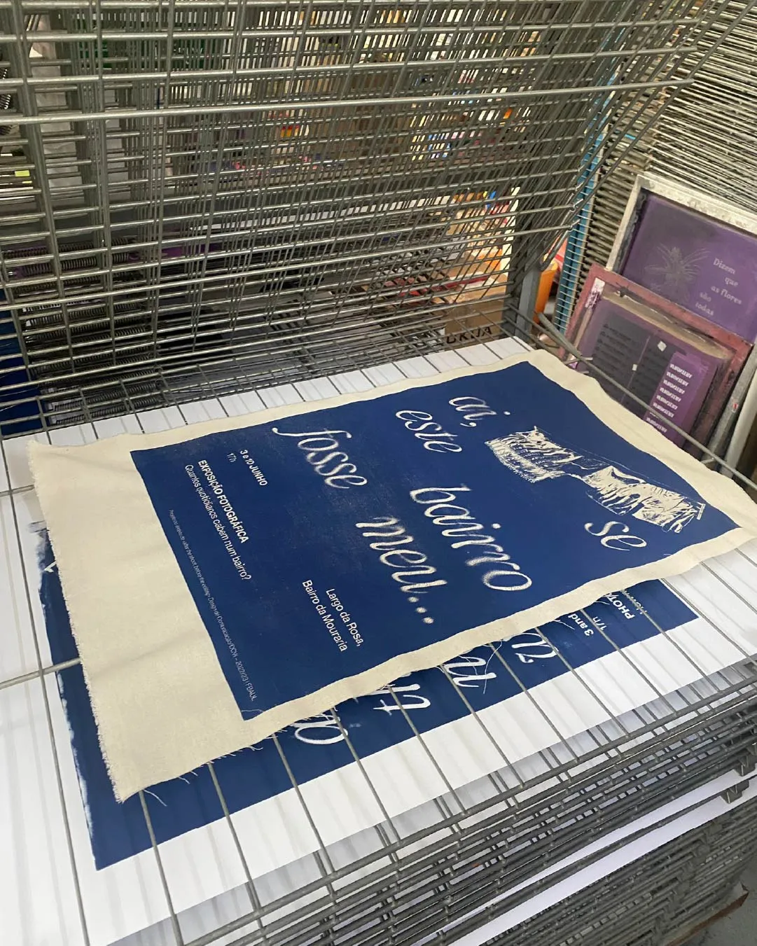
A self-portrait of Mouraria by its residents. Printed on fabric, analog photographic testimonies were displayed like laundry hanging from clotheslines and balconies, portraying the visual language that defines Mouraria’s streetscape.
Design
\ Color and Printing.
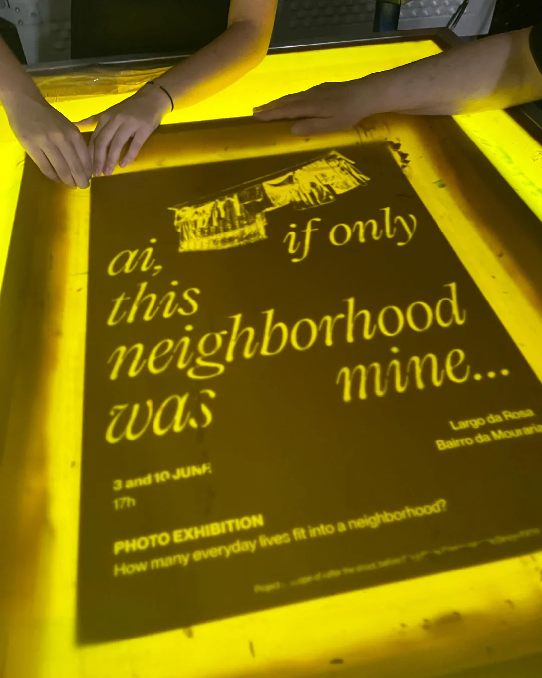
The visual identity of this project is defined by its bold blue, a color that evokes melancholy and serves as a reminder of the reflection the project invites. It is also shaped by the use of screen printing, a printing process that demands manual labor and craftsmanship, lending the identity a distinct human touch.
\ Typography.
The typographic choices come from Pangram Pangram Foundry. Editorial New by Mathieu Desjardins (with italics by Francesca Bolognini) is an elegant, narrow serif full of personality, used for the project’s title “ai, se este bairro fosse meu...”. Neue Montreal, also by Desjardins, is a clean and sharp grotesque with geometric simplicity, used for most of the supporting content.
\ Materials.
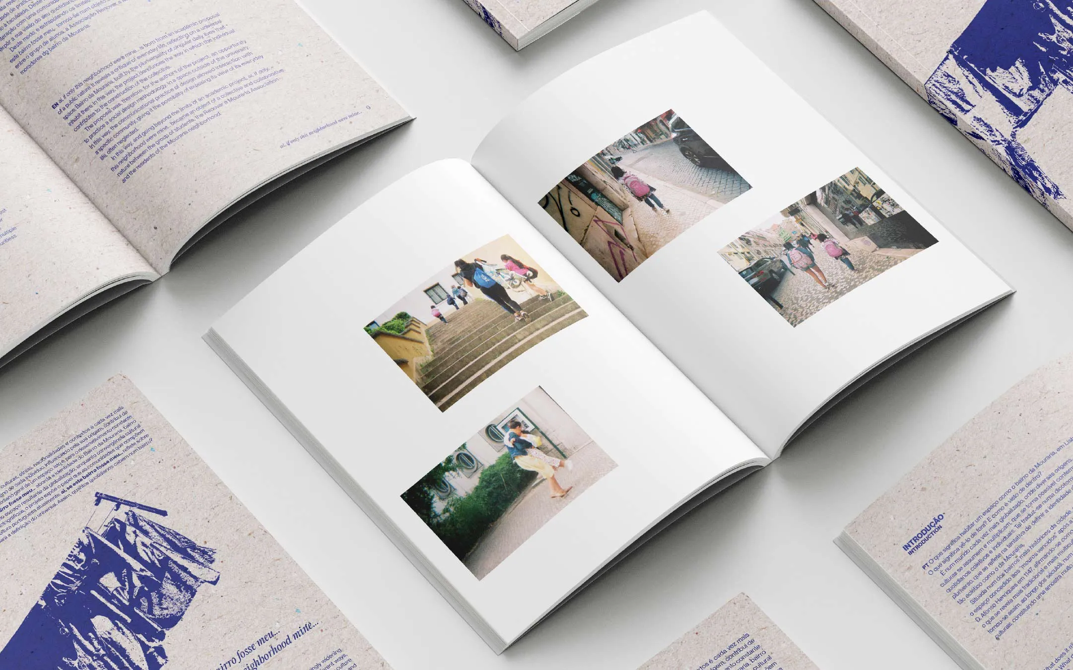
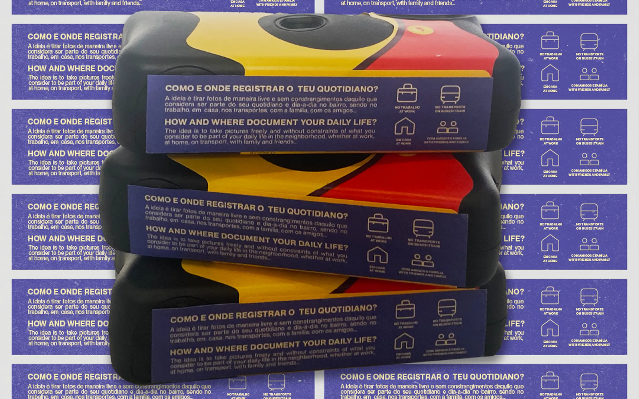
This project involved the development of a wide range of communication materials, including Posters, Website, Digital Content (Instagram posts and stories, E-mails), Stickers, Neighborhood Engagement Materials (Invitations to participate on the visual testimonies and Analogue Camera Instructions), Exhibition Leaflets, Exhibition Signage, an Editorial book/Photobook, Project Manual, and more.
© 2026 Leonor Couto — All rights reserved.