PROJECT
Linha Final, de Don DeLillo
CATEGORY
Editorial Design
YEAR
2022/2023
DESIGN
Leonor Couto (@leonorcouto_design)
Course
Laboratorio di Sintesi Finale - Sez.3, Politecnico di Milano
PRINTING
Morganti (@morganti_centrostampa)
The goal of this project was to create a visual reading experience (“Libro Visivo”) of Linha Final (End Zone), the romance by the north-american novelist Don DeLillo. A story where football is no longer just a sport, but a mirror for deeper existential themes, like nuclear war, violence, and the human condition, and its contemporary fears.
The design guides readers, through visual cues drawn from American football, while the narrator unfolds a meditation on humanity’s ultimate end zone [nuclear annihilation], through Football metaphors. The book takes shape as a symbolic [football~battle] field, reinforced by its illustrations, chapter structure and field-like page numbering. Its super-technical feel echoes the characters’ obsessive focus on nuclear strategy.
Concept
In Don DeLillo’s novel, the term “end zone” carries superimposed meanings, both literal and metaphorical, at the intersection of football, nuclear war, and the human condition and behavior.
In football, referring to the area at each end of the field, where teams score a touchdown. Metaphorically, it signifies the ultimate stage of nuclear annihilation, emphasizing humanity’s fascination with organized violence and apocalyptic finality.
This duality of terminology becomes a central metaphor for the thematic concerns, questioning sports function merely as entertainment or rather as a symbolic battlefield, thereby shaping the novel’s overall design.
Design
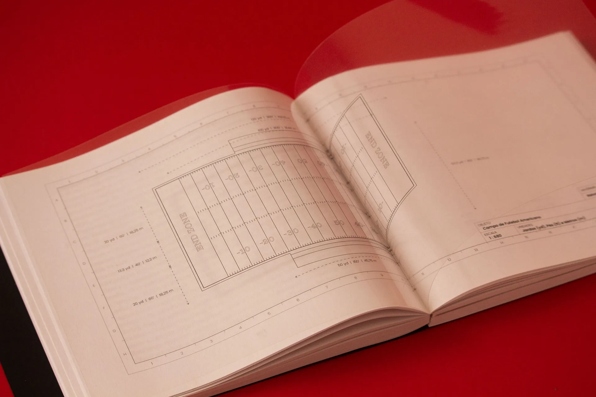
\ SIZE.
The book’s spread states a symbolic [battle] field, having the proportions of a football field, and reflecting the game’s central objective: reaching the end zone by moving from one side to the other. Similarly, the narrative guides the reader through layers of metaphor about human behavior and thought, the novel’s own “end zones”, gradually deconstructing them and culminating in the protagonist’s ultimate end zone, at the end of the narrative. In this way, the reader becomes a player on the field, advancing toward an understanding of these symbolic territories.
\ PARATEXT.
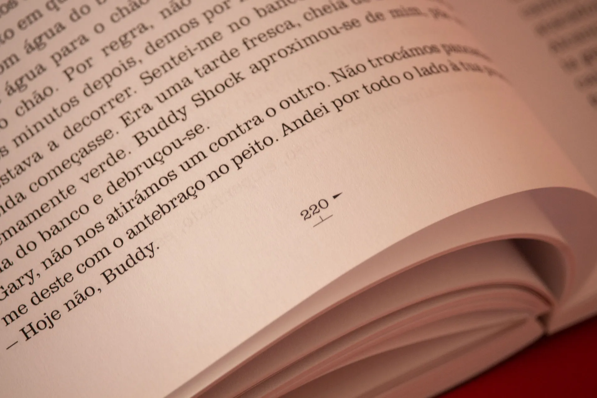
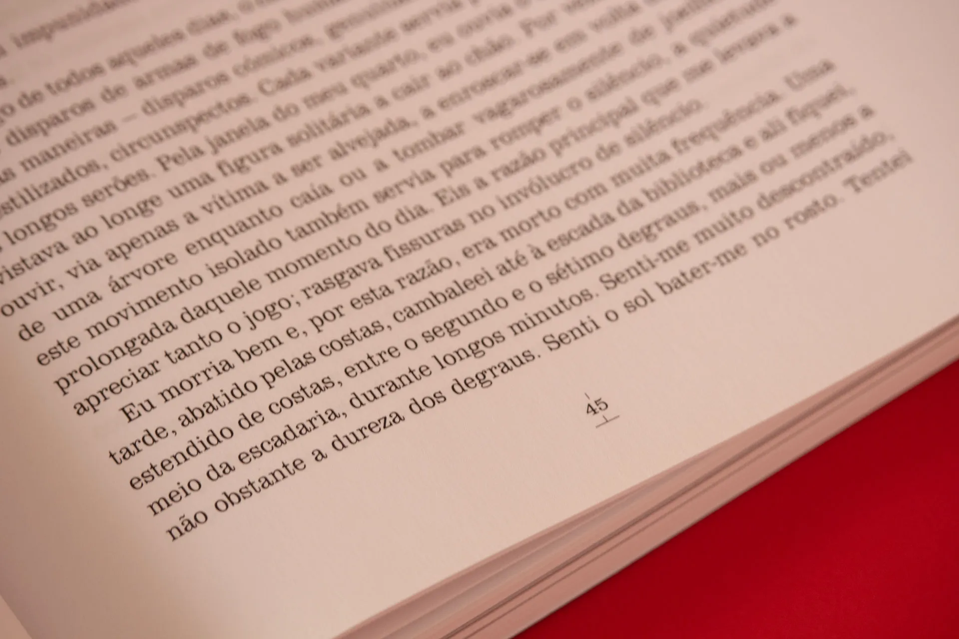
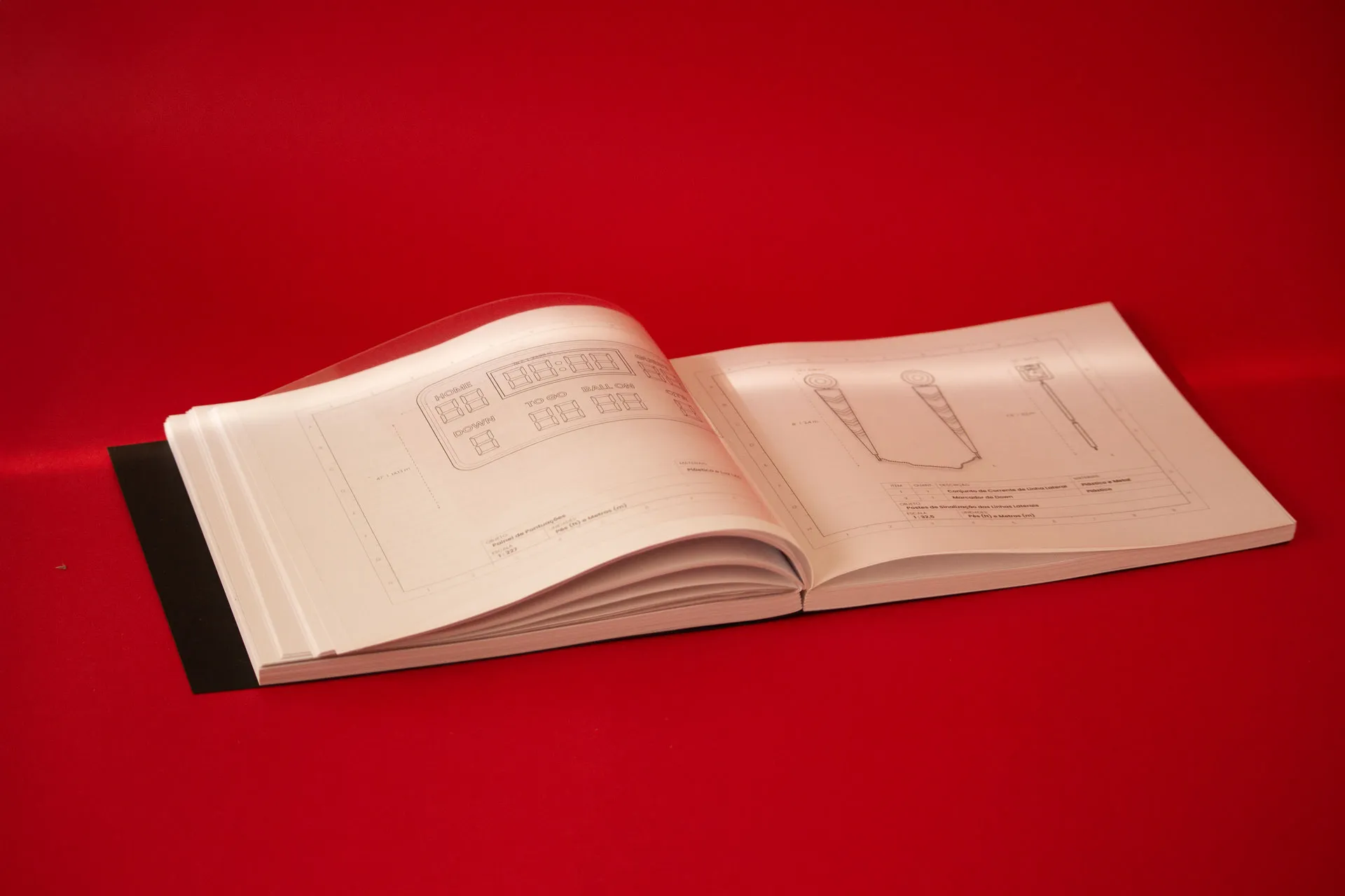
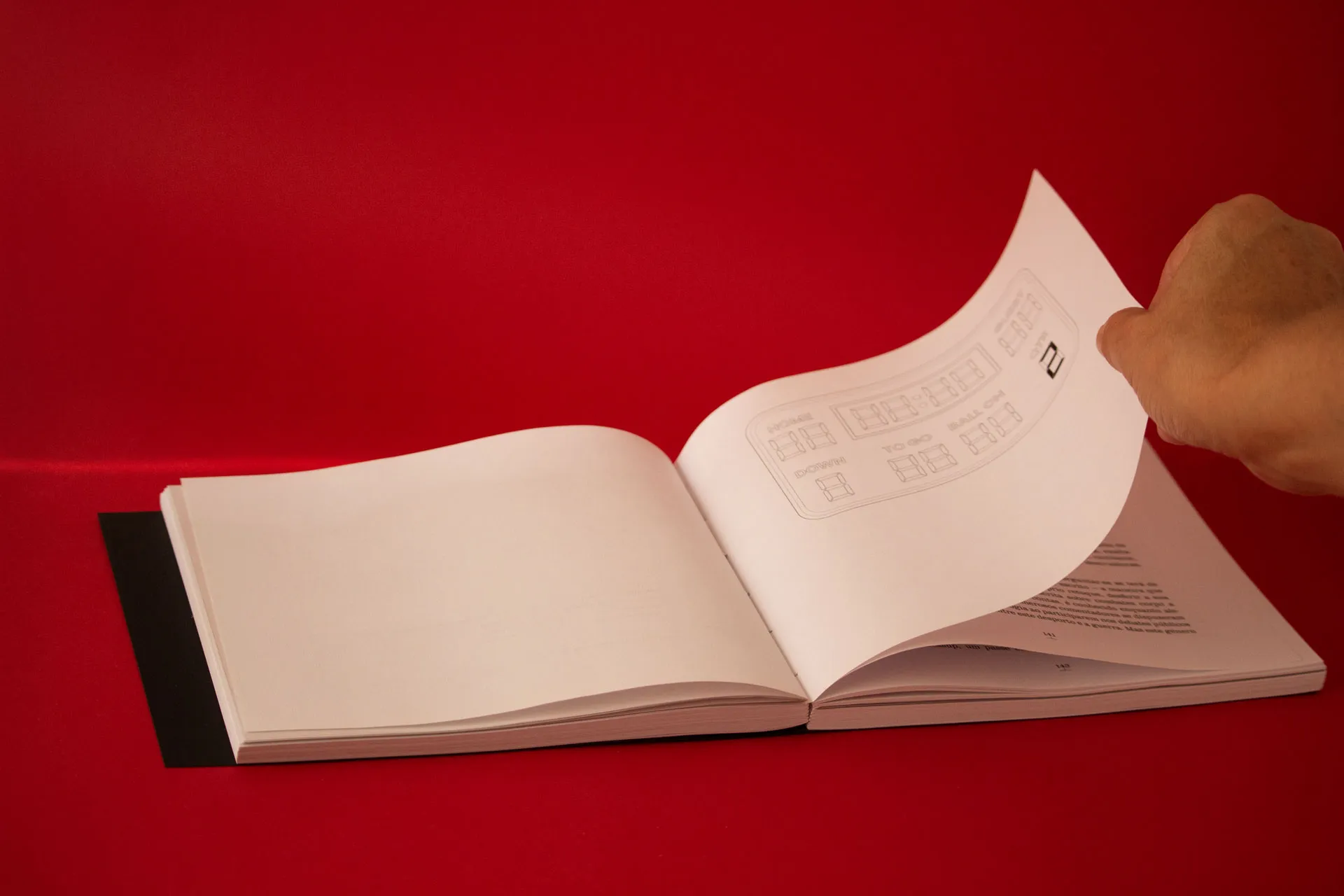
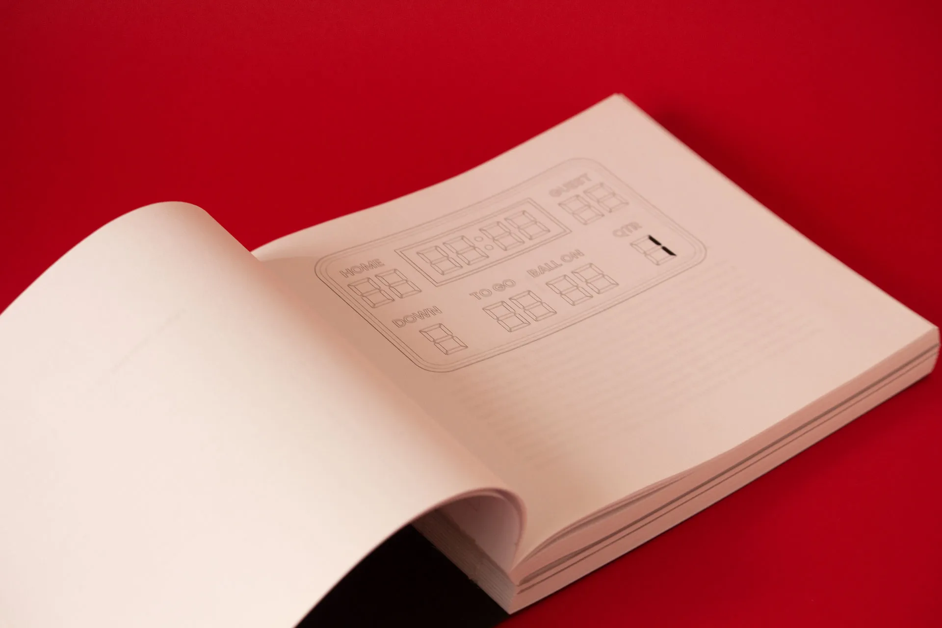
The paratext also reinforces this [football~battle] field idea: the pagination numbering system, works as Yard Lines, positioned at the bottom of the page, recalling the yard markers on a football field. The pages multiples of 10 are marked with a small triangle arrow, pointing toward the nearest goal line. At the midpoint of the book, the arrow direction reverses, emphasizing the absence of a linear storytelling, by the juxtaposition of plots. The multiples of 5, indicated with a thicker line than standard page numbers, and all other pages, with a small mark.
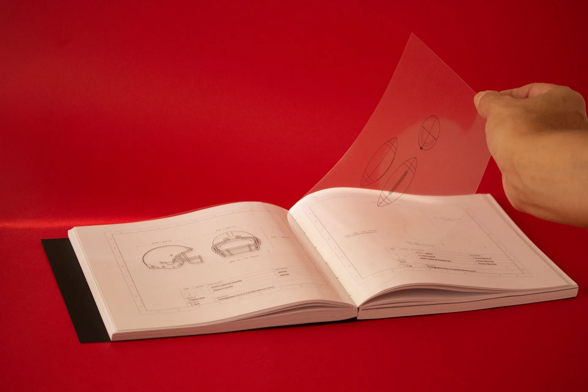
\ ILLUSTRATIONS.
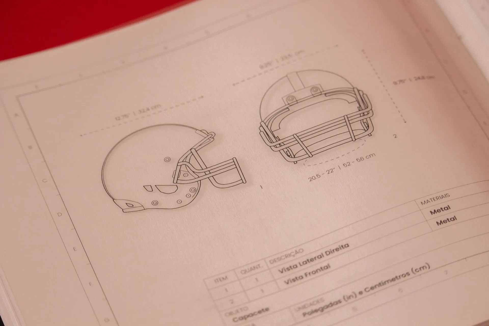
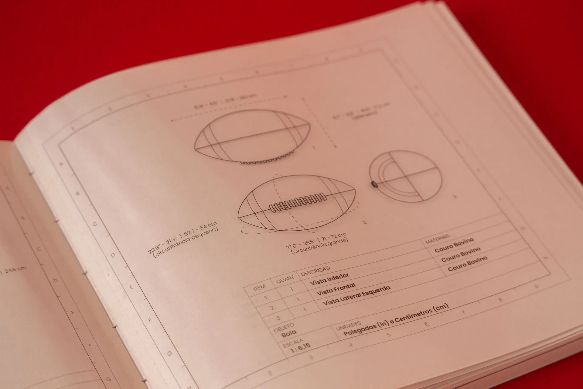
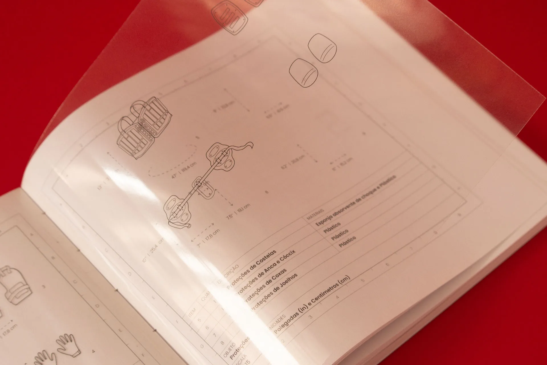
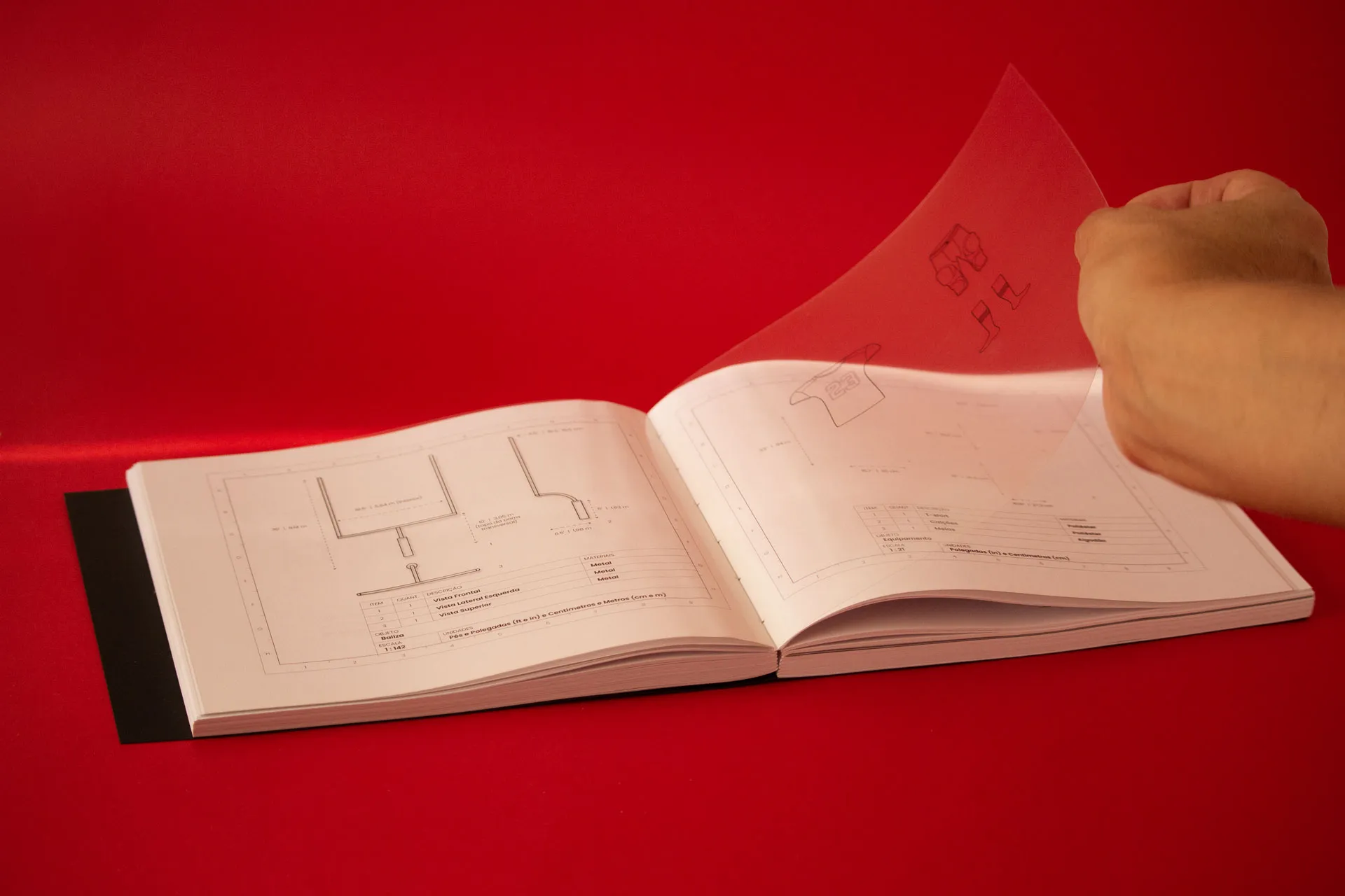
The book is also accompanied by illustrations, which were included to explain certain technical terms of American football for readers unfamiliar with the sport.
\ Chapters.
The book is divided into three parts, visually represented as the quarters of a game on a scoreboard.
\ Typefaces.
The typefaces used [Clarendon, by Robert Besley ~ Poppins, by Indian Type Foundry (ITF) / Jonny Pinhorn (for Latin script) ~ DS-Digital, by Dusit Supasawat] further reinforce the American football visual aesthetic of the book.
Printing and Final Touches
\ INSIDE.
Fedrigoni Arena Extra White Rough, 90 g/m2
An Extra White paper, that transparences the jargons of American Football and Nuclear Startegy.

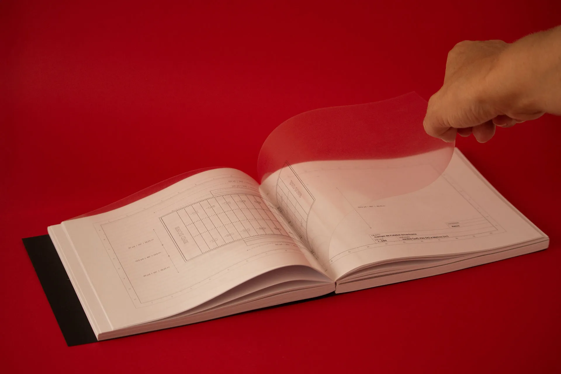
\ TECHNICAL ILLUSTRATION PAGES.
Universal Transparent Film (Acetato)
A transparency that allows seeing throught the matterial, allowing the layering of the American Football objects with anything behind it, as a metaphor for the [football~battle] field.
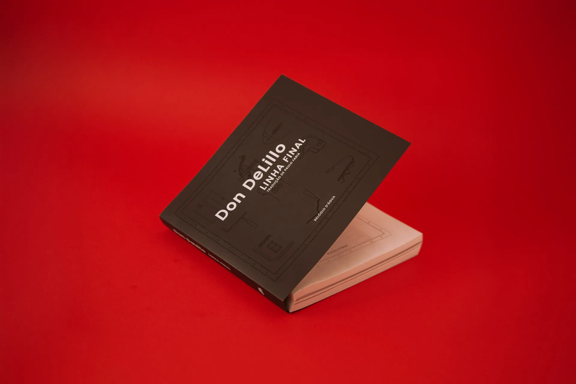
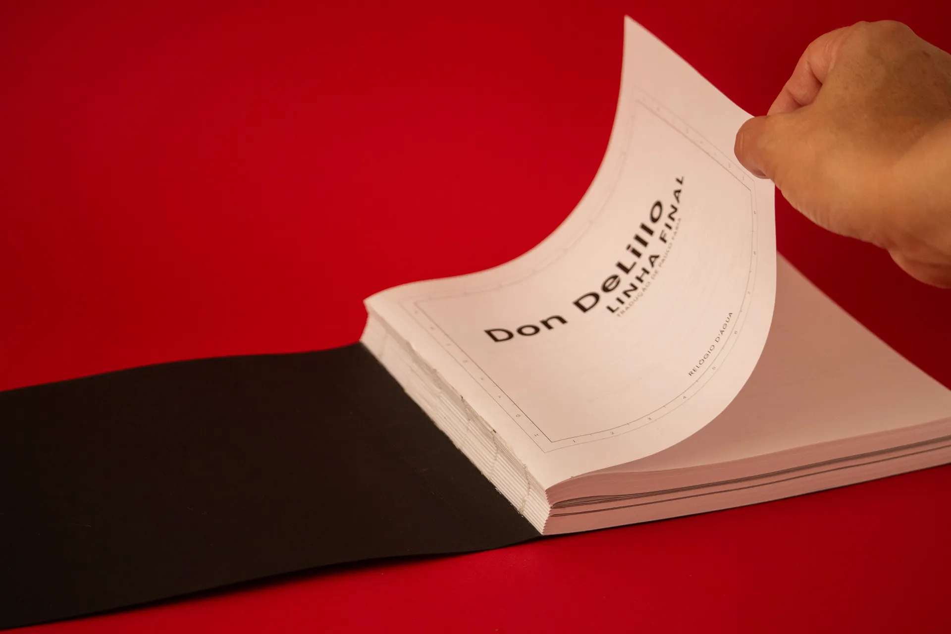
\ COVER.
Cordenons Plike Black 330 g/m2
UV Printing
The black cover contrasts with the inside witish pages, giving the book a darker tone. The UV Printing is used to portray subtly the topic of American Football through a darker surface, a metaphor for the justaposition and comparison of topics of the book.
A special thanks to Morganti (@morganti_centrostampa) for bringing this project to life with their excellent printing and valuable guidance during the final steps!
© 2026 Leonor Couto — All rights reserved.