PROJECT
Il Topo che mangiava i Gatti
CATEGORY
Editorial Design
Illustration
YEAR
2022
DESIGN
Leonor Couto (@leonorcouto_design)
Course
Laboratorio di Sintesi Finale - Sez.3, Politecnico di Milano
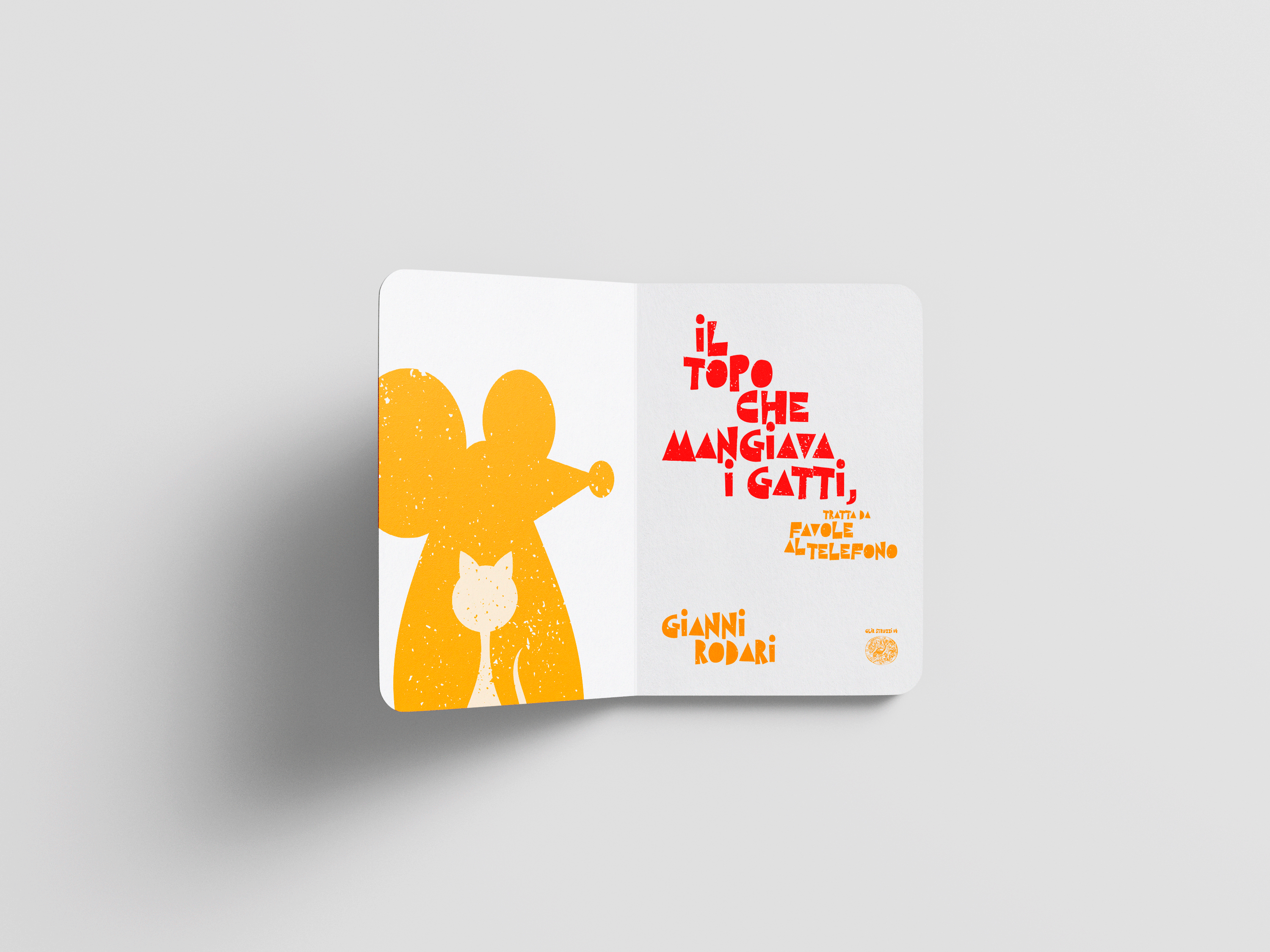
This children’s book is inspired by Gianni Rodari’s tale Il topo che mangiava i gatti, from Favole al telefono.


Design
The design choices were guided by its target audience [children]. Bright and cheerful colors were used to capture attention and encourage engagement with the story. The illustrations are only 3, but they were combined in different ways to enhance the narrative.
The layout makes use of dynamic composition and generous white space, creating rhythm while supporting both storytelling and dialogue.
The typefaces were carefully selected for clarity and readability. Gilmer Medium, a geometric sans-serif typeface by Piotr Lapa, offers smooth legibility, well-suited for young readers. For the titles, West Side by Artimasa Studio, a block-styled handcrafted typeface with a relaxed, human touch, was chosen to complement the illustrations and add personality.


© 2026 Leonor Couto — All rights reserved.